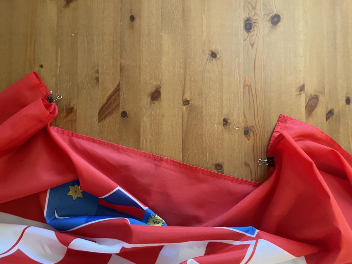
Black and Greene T

The Power T has been Tigard High’s symbol since 2012.
November 9, 2018
Every Tigard student recognizes the Power T, but most don’t know who made it or how it came to be the school’s logo.
So where did the Power T come from? Who designed the logo that would become a well-known symbol of Tigard High?
“Ralph Greene and I,” answered Ken Black, one of the co-creators of the Power T.
Black and Greene used to work at Nike as a creative director and brand marketing representative, respectively. Both of them had children who went to school at Tigard High. At the time they created the Power T, Black’s daughter Maddie was a senior.
After their children (seven in total) graduated from Tigard, Black and Greene agreed they wanted to do something special for the student body. So they sat down with then-principal Mark Neffendorf and sports director Alan Boschma to discuss a new logo for the school.
Neffendorf and Boschma were on board with the idea. “The previous logo was extremely difficult to read if it wasn’t printed on a white background at a large size,” Black said. Neffendorf and Boschma were happy to see parents supporting the community. Black and Greene began creating various different logo prototypes, treating it like they had their design projects at Nike.
“The logo before the Power T was a knockoff of the New York Jets logo; we felt it was a good time for Tigard to have its own original mark,” Black said, recalling the process of making the artwork and adding it to helmets, T-shirts, hats, etcetera.
Black and Greene finished with multiple design options for the administrators to choose from. To ease the difficult selection process, Black and Greene assigned names to the different symbols. The T “…in particular looked the most like a superhero insignia to all of us[…] which spoke to POWER—so it just kind of stuck,” Black said, naming it the Power T.
The Power T was unveiled to the senior class of 2012 at the end of the year, and was subsequently sold on a product for the first time at the beginning of the 2012-13 school year. With all the hard work over, Tigard finally had a brand new symbol.
“[We] hoped the mark would come to represent the level of excellence that everyone in the Tigard family could be proud to wear,” Black said.
Receptionist Shari Balcom, who has been working at Tigard for 12 years, remembers when Black and Greene introduced the Power T. In the first year, Balcom says, students didn’t like it very much based on sales of spirit gear with the new logo. But by the second year, they couldn’t keep Power T gear in stock. Balcom believes the initial apathy for the Power T was simply because “people don’t like change.” After some time, though, the staff and student body embraced it as their symbol.
Alan Boschma credits alumna Maddie Black as being the impetus for the change.
“Maddie Black[…] had an idea that would change Tigard High School for a long period of time,” Boschma said.
He appreciates the simplicity and meaning of the split T, which represents the two T’s in “Tigard Tigers.” Though Boschma was only partially correct, Maddie did have an impact on the creation of the Power T.
The green and black T represents Tigard High to this day, not only as a symbol of strength and pride but as a reference to the cooperation between Black and Greene to form something exciting and bold for this school.